Copa Players
Seasonal campaign, steady system.
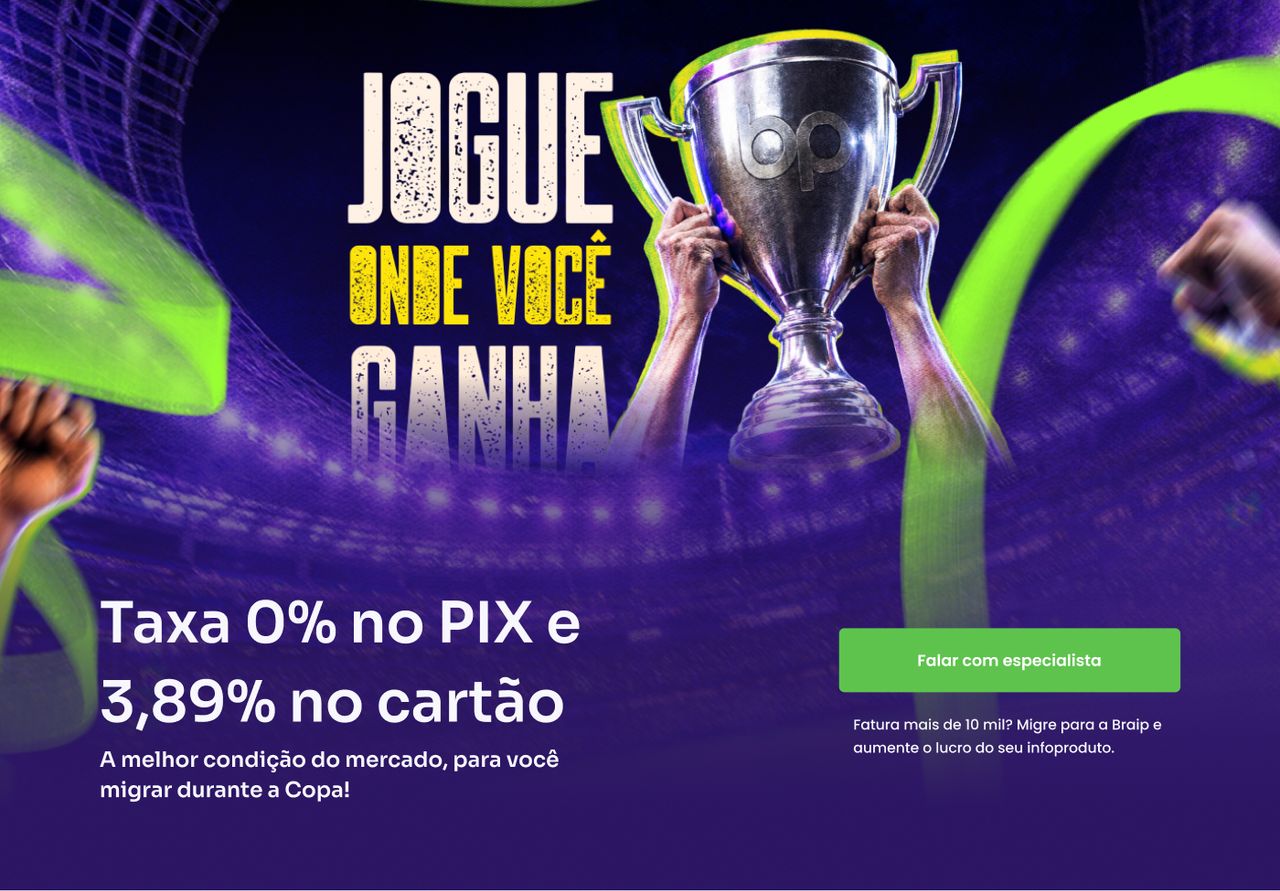
A migration landing page that borrows the World Cup's visual language to sell the lowest fee on the market.
- Problem
- Selling a platform migration to people already making money, with the World Cup metaphor and the offer competing for the same fold.
- What I did
- Designed the hero as a layered poster — campaign artwork on top, live-text fee headline and CTA below.
- Outcome
- Desktop, mobile, and thank-you prototypes delivered and flagged ready for validation. Conversion data stayed with the client.
 02
02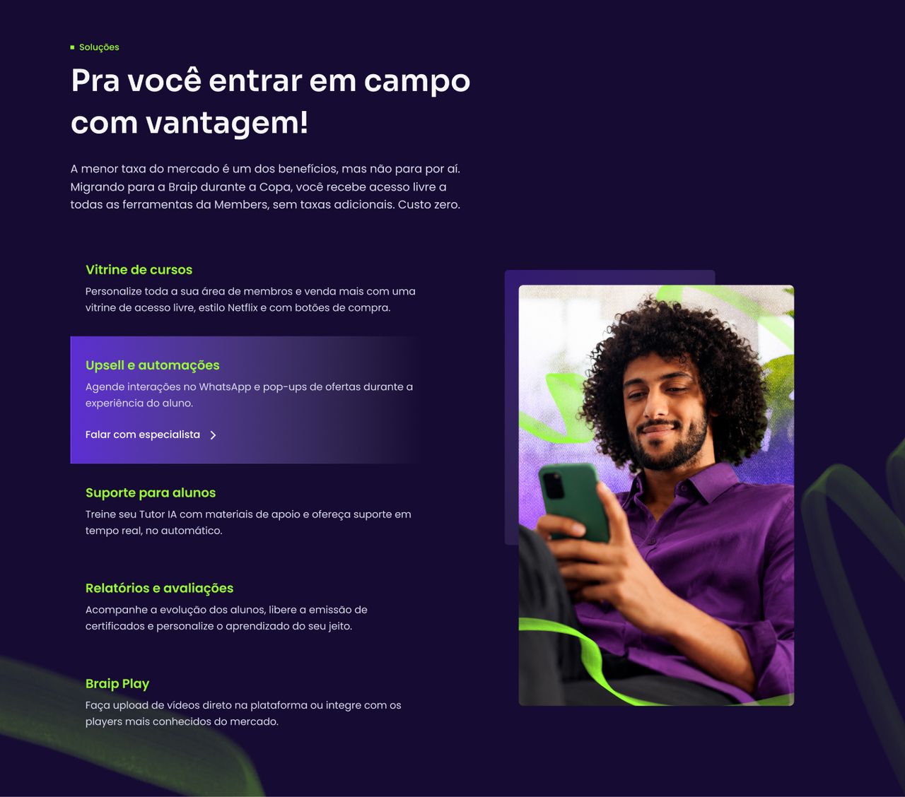 03
03
Full processContext, decisions and evidence, for those who want the detail.
Context
Braip is a digital-product platform, and this landing page has a narrow target: creators already billing more than R$ 10,000 on a competing platform. It isn't a beginner acquisition page — it's a switch-your-provider page, aimed at people with a running operation and therefore a lot to lose in a migration.
The campaign uses the World Cup as an urgency hook. The offer is concrete and dated: 0% fee on PIX and 3.89% on card, for migrations confirmed by 19 July 2026 — the length of the tournament, no longer. That deadline is what turns "consider migrating" into "decide now", and it's what justifies a separate page instead of a section on the main site.
The problem
A seasonal campaign arrives with two things to say in the first fold, and they compete: the metaphor (cup, trophy, team, crowd) and the number (0% on PIX). The metaphor sells attention; the number sells the decision — and the number is what this audience came to check.
The risk with themed campaigns is the artwork swallowing the offer: people understand there's a World Cup promo and never learn what it actually is. The hero's job was to prevent that without giving up the tournament mood, which is exactly what earns the page its urgency.
My role
- High-fidelity UI for the desktop landing page and the mobile version
- Clickable prototype of both breakpoints, including the thank-you page
- Hero composition from the campaign art assets
What was not mine: the copy, which arrived finished as an attachment from marketing; the design system, which is the Braip Foundations library; and the deploy, handled by engineering.
Process
Receiving finished copy changes the order of the work: instead of finding the message by designing, the design starts with the hierarchy already settled in words. "0% fee on PIX and 3.89% on card" is the headline, "Billing more than 10k?" is the audience qualifier, "Talk to a specialist" is the only action. My job was to honour that hierarchy in pixels, not renegotiate it.
The base components — buttons, FAQ accordions, cards, footer — came from Braip Foundations. That accelerated everything structural and concentrated the real time where it mattered: the hero and the solutions block.
Key decisions
The hero as a poster, not a banner
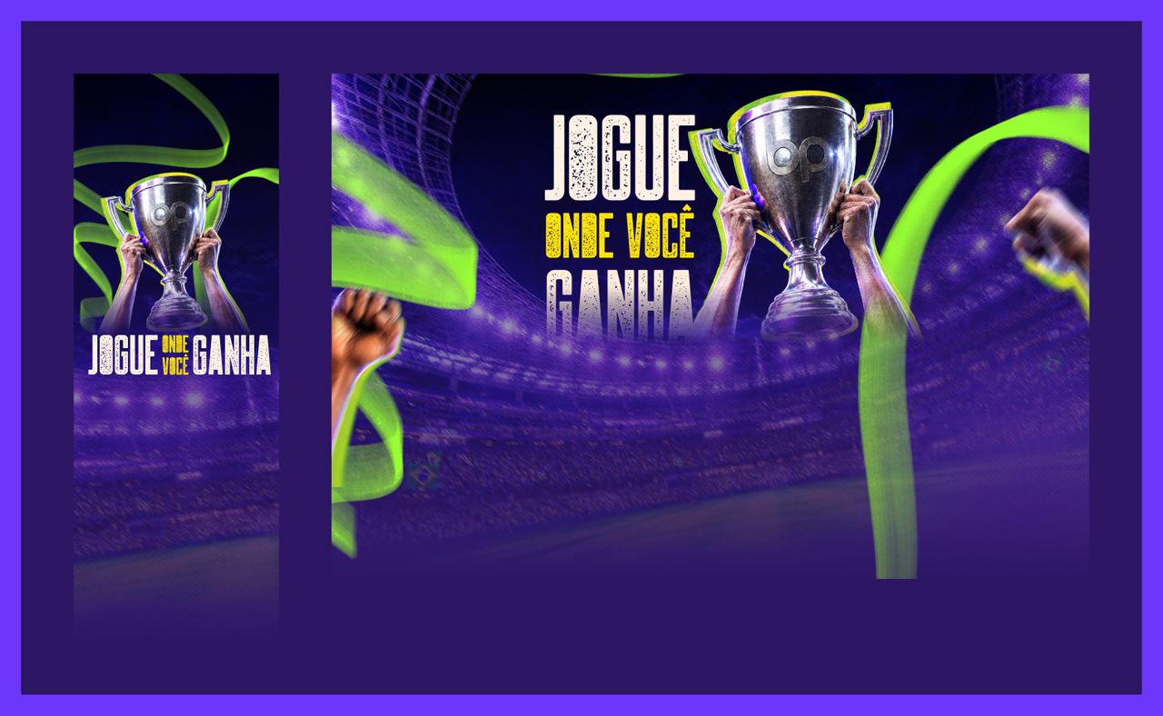
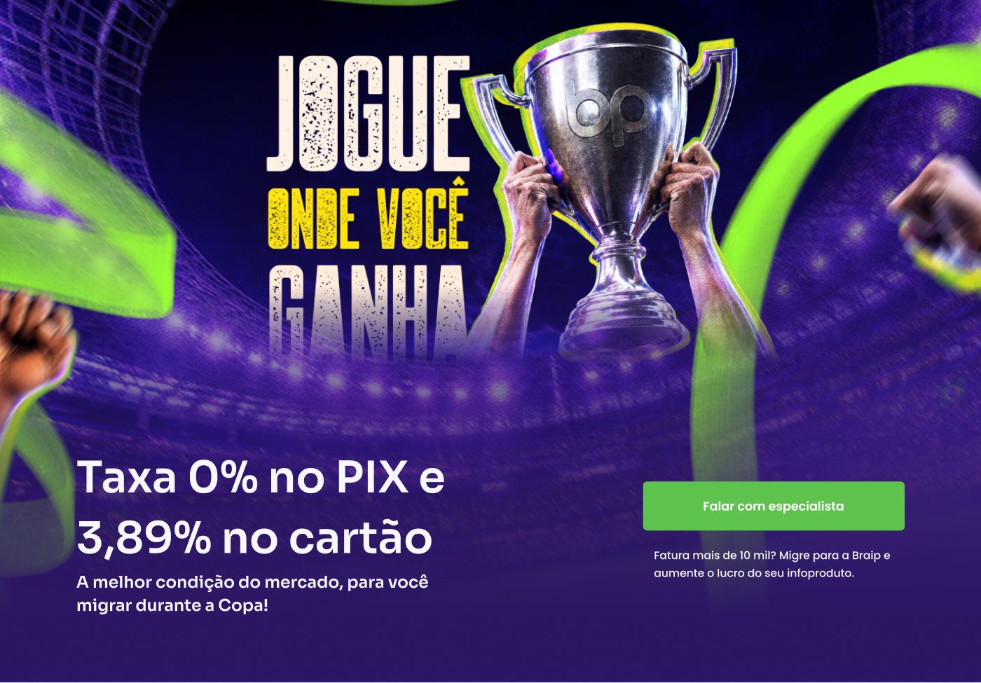
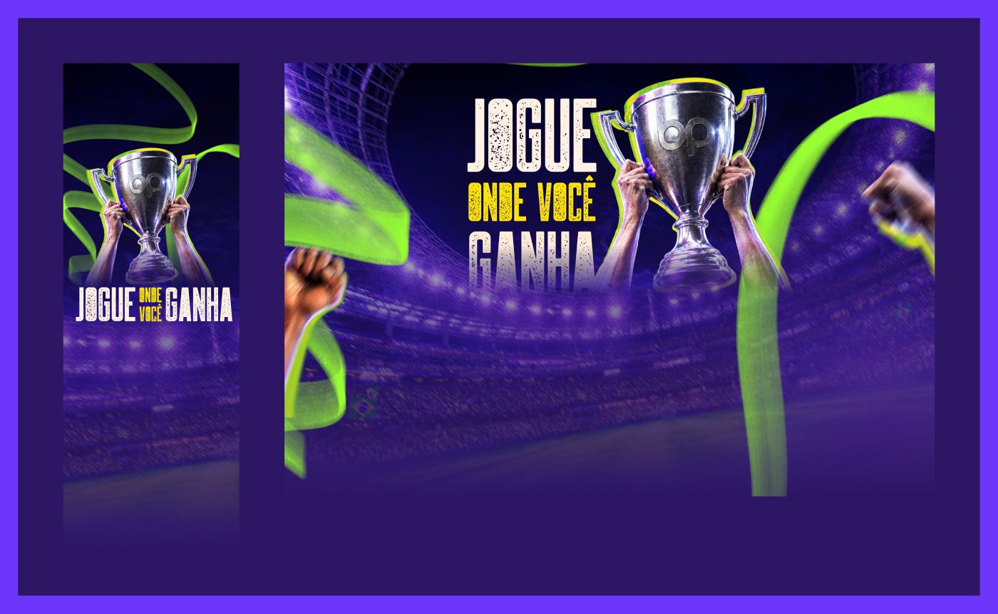
The "Jogue onde você ganha" lettering is treated as typographic art — cut out, with a trophy and crowd hands breaking the edges, filling the top like a championship poster. But it stops before the fold's midpoint. Below it the page changes register: solid background, clean design-system type, the fee rendered as real text.
That split is the central decision. The upper layer is emotion and campaign recognition; the lower one is information. Keeping the fee as text — rather than baked into the artwork — means it stays legible at any size, selectable, translatable, and editable without reopening the art file when the number changes.
Four promises, one at a time
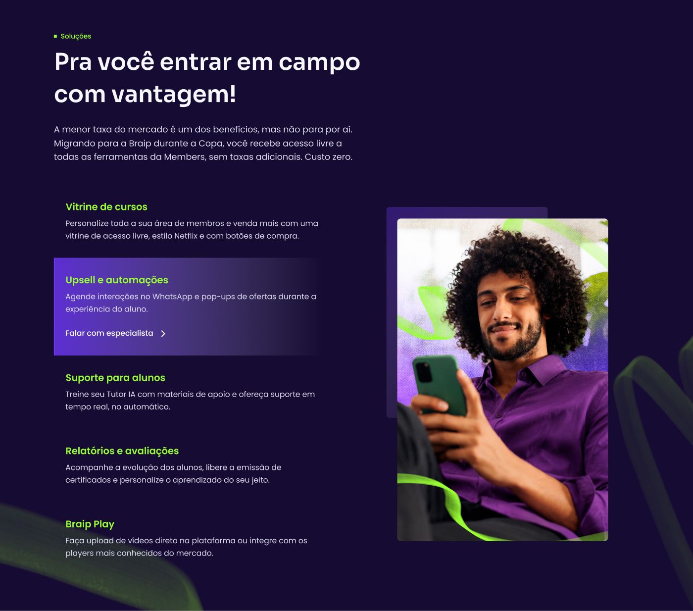
The Braip Members solutions block could have been a grid of five identical cards — a wall nobody reads. I chose a vertical list where only one item is expanded, with title, description, and CTA, while the rest collapse into clickable headings. A large image beside it tracks the active item.
That trades "see everything" for "see one thing", which is what the page needs: the reader isn't comparing feature sets, they're being convinced there's value beyond the fee.
Outcome
I delivered high-fidelity prototypes for desktop (1440 × 5349) and mobile (390 × 6275), plus the thank-you page at both breakpoints, with the file's status label set to "ready for validation".
I have no conversion figure to show. The page belongs to the client, so does the analytics, and the performance data stayed on their side — inventing a number here would defeat the reason this portfolio exists.
What's still open
- The migration form is a placeholder. Section 03 has a grey rectangle where the form goes, a "Lorem ipsum", and three bullets carrying copy recycled from a different landing page ("flexible hours", "fast, safe results", a paragraph about affiliate marketing that doesn't belong to this campaign). That's why the section appears in none of the images here.
- The offer contradicts itself across breakpoints. Desktop says "3.89% on card"; mobile says "3.89% + R$ 2.49". One of them is wrong and it needs marketing to settle it before launch.
- No metrics collected on my side.
What I'd do differently
I designed the hero desktop-first and only then solved mobile — and paid for it. A poster composition that works at 1440 px has no honest version at 390 px, so mobile became an adaptation rather than a design: art shrunk to the top, message rewritten to fit. Starting over, I'd design the offer block on mobile first, where space is expensive, and treat the championship artwork as the layer that expands on desktop.
I'd also have locked the form copy before prototyping. Leaving a placeholder section inside a prototype flagged ready for validation hands the reviewer a job that was mine — noticing that the block isn't content, it's a hole.
Outcomes are qualitative: I'm not cleared to publish these projects' metrics.
 Next →Creators KitA whole brand swapped in one click.