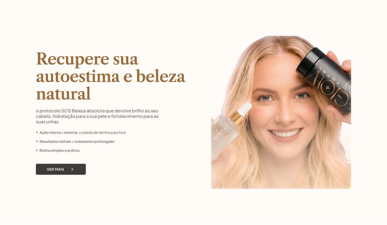
SOS Beleza Absoluta
A style guide, stress-tested.
Building a project-specific style system on top of Braip Foundations, then using a fourteen-section landing page across three breakpoints as its stress test.
- Problem
- A long landing page starts life as a pile of loose decisions — every section invents its own shade of beige, its own heading scale, its own spacing. Across fourteen sections and three breakpoints, that becomes debt before it becomes a page.
- What I did
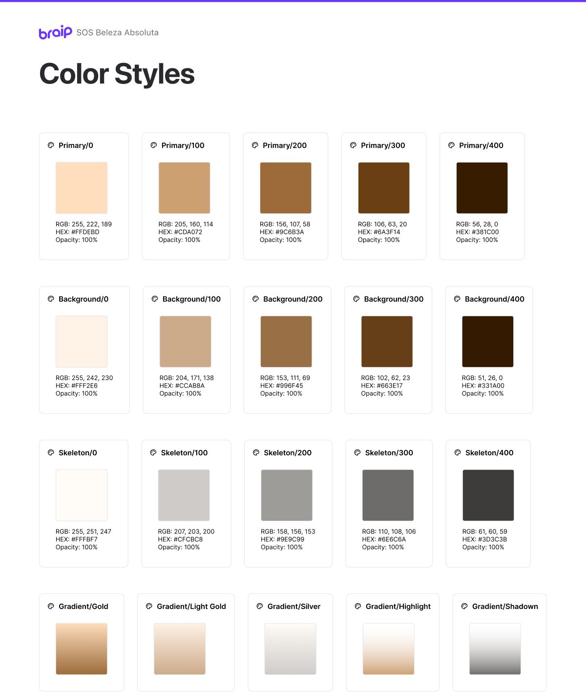
- I built a project-specific style guide — Color Styles, Text Styles and a colour and typography variables library inheriting from Braip Foundations — and only then designed the page, treating each section as a coverage test of the system.
- Outcome
- Fourteen sections across desktop, iPad and mobile built on seventeen custom components, with no stray colour or text size. Testimonials and product pricing stayed pending on client content, and are declared as such.
 02
02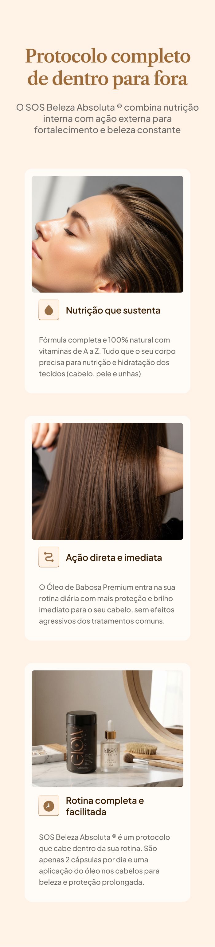 03
03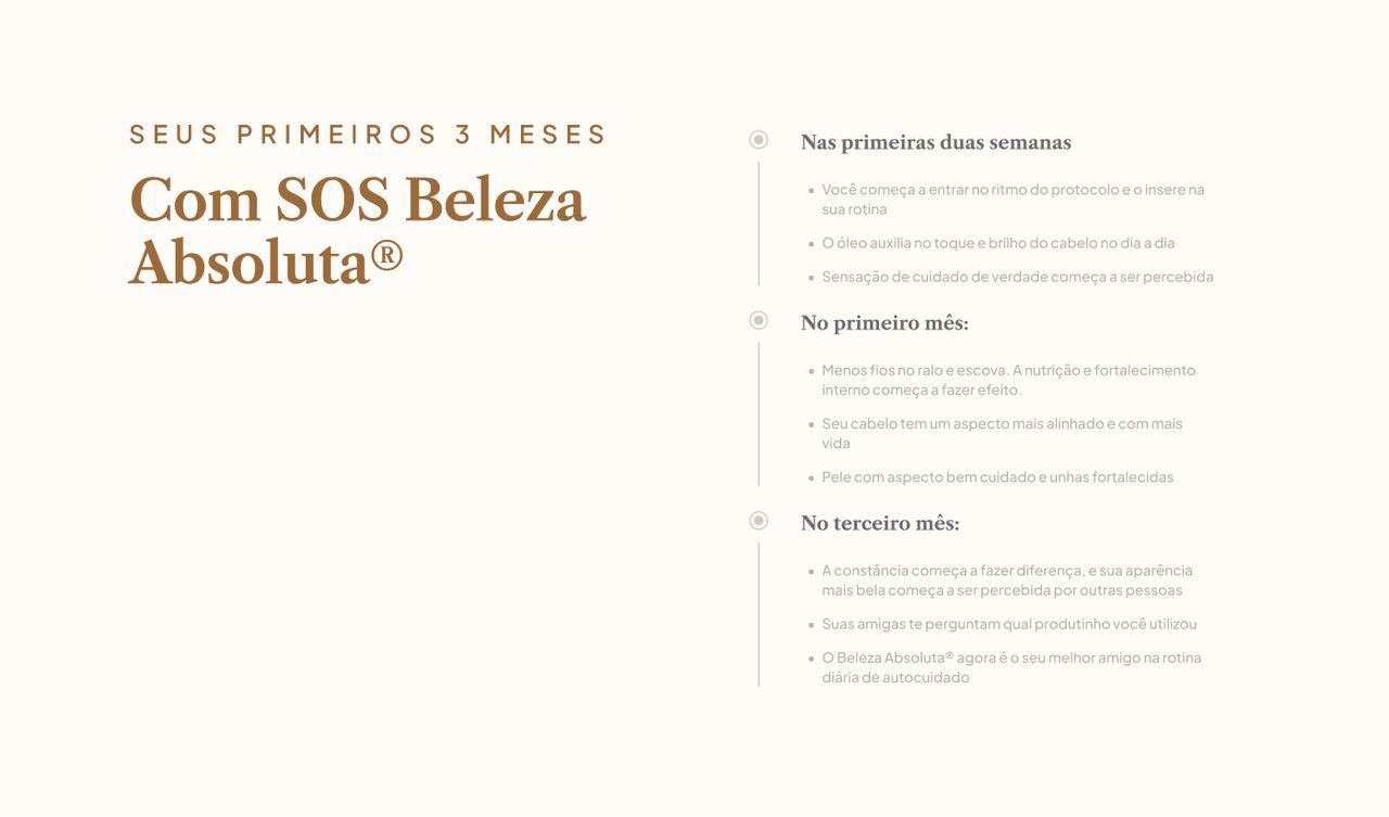 04
04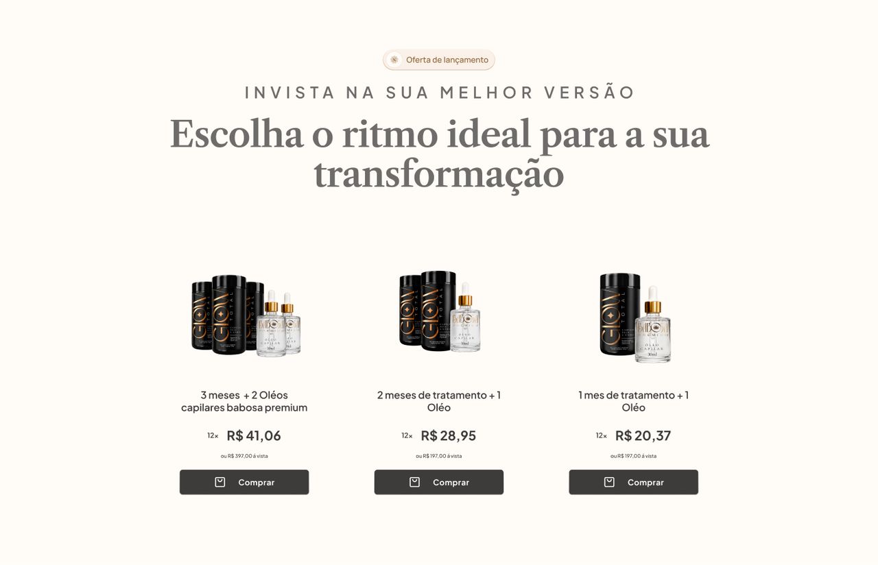 05
05
Full processContext, decisions and evidence, for those who want the detail.
Context
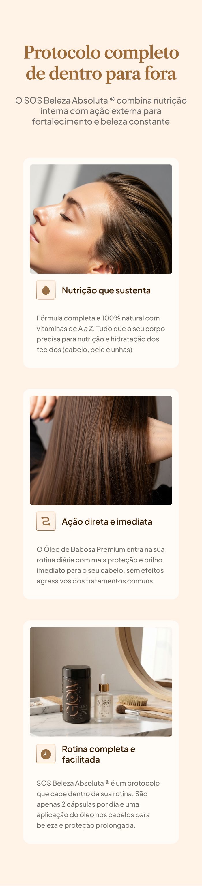
SOS Beleza Absoluta is a two-product beauty protocol: an A-to-Z vitamin capsule and a topical aloe oil. The promise is inside-out — internal nutrition sustaining the result, external action delivering immediate shine. The product sells through a long landing page, the kind that answers every objection before asking for the card.
The copy arrived finished, from the marketing team. The argument structure — pain, protocol, differentiator, timeline, social proof, guarantee, offer, FAQ — was already settled when the file reached me. What was open was everything that comes after: what this looks like, how it behaves at three screen widths, and what keeps fourteen sections from reading like fourteen different pages.
The problem
Long landing pages have a specific, tedious failure mode: they rot by addition. Section 3 wants a beige a touch warmer than section 2's. Section 7 needs a heading size between the two that exist, so a third is born. Nobody makes a bad call — each one is reasonable in isolation. You end up with eleven beiges, six heading scales and no way to shift the brand without opening every section.
Multiply by three breakpoints. Desktop at 1768 px wide, iPad at 1024, mobile at 480 — and a page that, on mobile, runs 15,302 px tall. That's where loose decisions charge interest: every stray value becomes three stray values.
So the real problem wasn't "design a landing page." It was: is there a set of visual decisions small enough to cover an entire sales page, with no exceptions? The page became the experiment that answers it.
My role
- Project style guide: Color Styles, Text Styles and a colour and typography variables library inheriting from Braip Foundations
- A page-specific component library — seventeen components and component sets
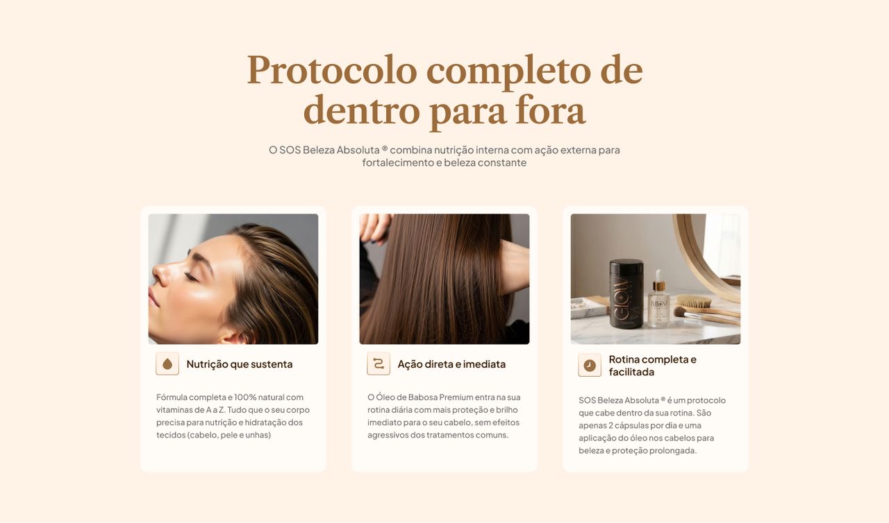
- UI for all fourteen sections, adapted to desktop, iPad and mobile
- Art direction and product compositions
What wasn't mine: all copy — headline, bullets, FAQ and testimonials — came from the marketing team, as did the page's argument architecture. I was handed what the page needed to say and decided how it says it.
Process
The work started backwards from the obvious: before any high-fidelity screen, I wireframed all three widths with the copy that existed. The file's changelog records that version as 1.0, dated 20 March 2026 — "version with only the copy developed so far." Art and imagery came only after the team's feedback.
The style guide slotted in between wireframe and art. It isn't a client deliverable; it's my own infrastructure, built so the next phase would move fast and so the page couldn't drift away from itself.
Braip Foundations supplied the base — the design system where I was already working on token architecture. That shortened the expensive part: I didn't restart the colour scale or the typographic fundamentals from zero, I inherited and specialised them. Worth stating plainly, because it's the reason a project style guide fit inside a landing page schedule at all.
Key decisions
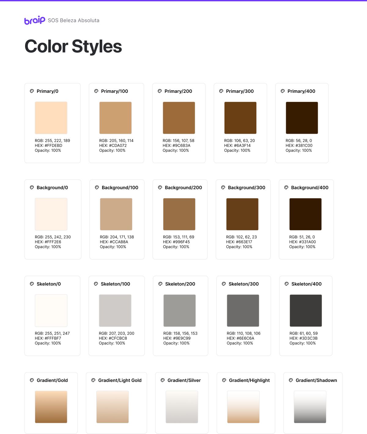
The system before the first screen
Color Styles, Text Styles and a variables library came before section 1. The rule I set myself was simple and uncomfortable: no colour or text size enters a section unless it's in the system. When a section asked for something that didn't exist, the question wasn't "what value do I use here" but "is this need real enough to become a project decision?"
Most of the time it wasn't — and the section resolved with what was already there. That's why the palette stayed small: it's small because it was forced to be, not because I was disciplined in the moment of each screen.
Seventeen components instead of fourteen sections
The page isn't made of sections, it's made of parts. Produto, Button, Card Modal, Timeline Text, FAQ, Card/text image, Image/Flow, Promo bar, Picture/Sanfona, Footer responsive — each with its own variants.
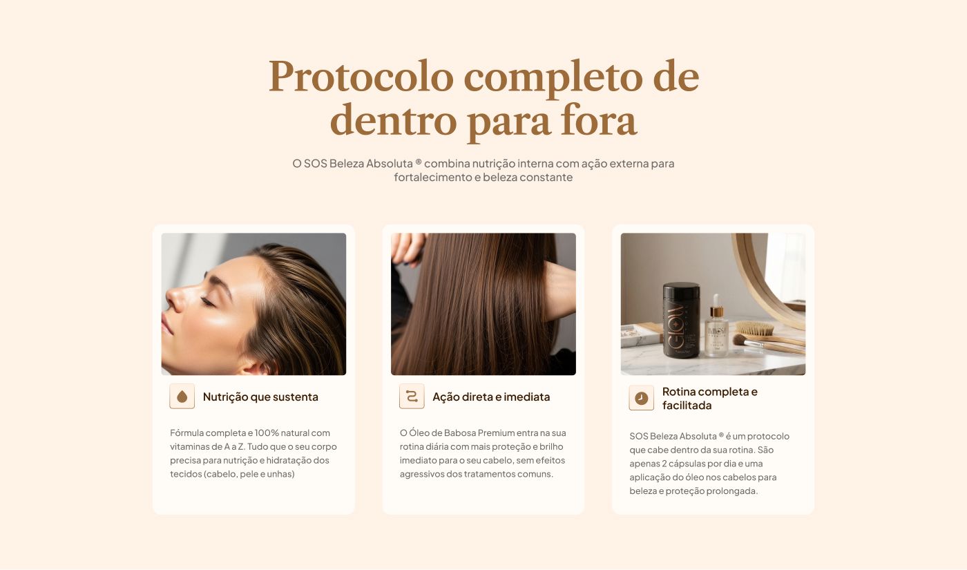
That changes the cost of responsive work. Adapting fourteen sections to three widths is fourteen problems solved three times. Adapting seventeen components is seventeen problems solved once, and the sections inherit. The mobile carousel, for instance, is its own component set — the protocol section doesn't know it became a carousel, it just composes the right part.
Designing time as part of the product
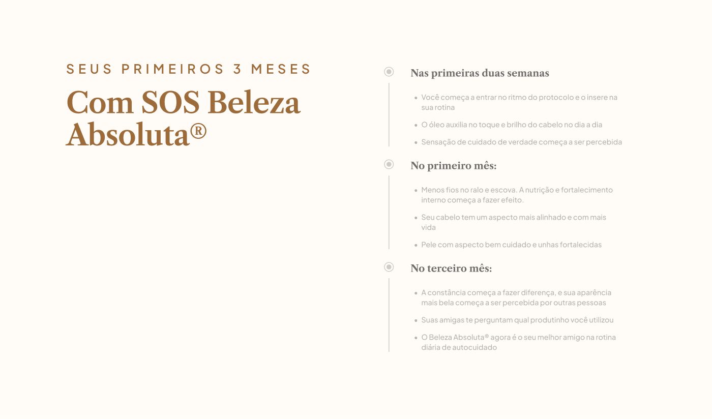
This is where the system met the content. The protocol only delivers with consistency — the first two weeks are adjustment, the first month brings less shedding, the third is when other people notice. A page that only shows "before and after" lies about that.
The timeline section exists to make the wait visible rather than hide it, and it runs on a dedicated component, Timeline Text, with variants per milestone. Every stage carries the same typographic weight — none is highlighted as "the moment it works." It's a system decision with an honesty effect: with no hierarchy between milestones, the page can't imply the result arrives sooner than it does.
Three rhythms, not three prices
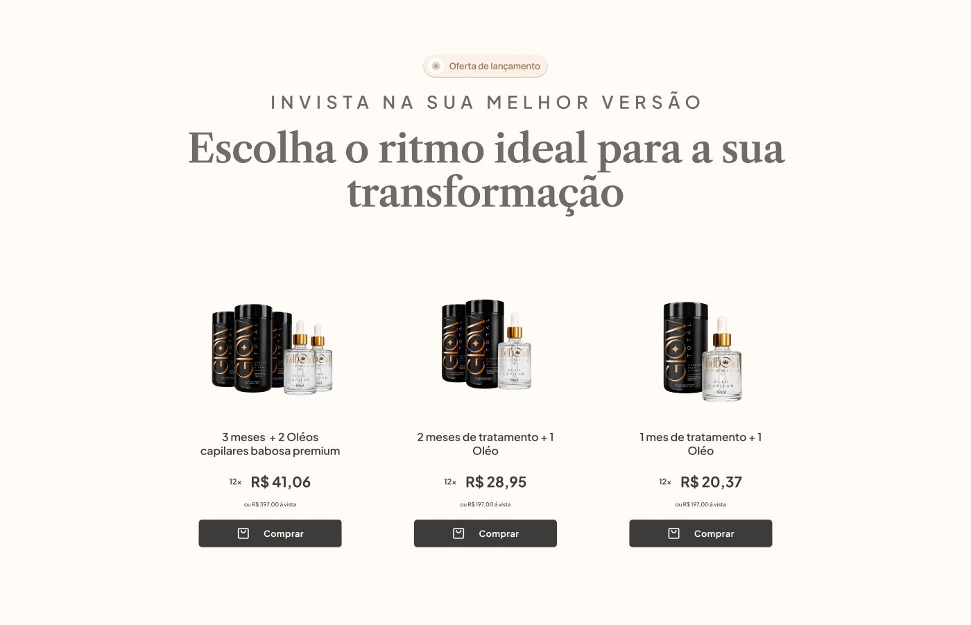
The offer section presents three plans — three months, two months and one month, with oils included according to the plan. The default temptation is to sort by price and highlight the middle one. I chose to treat the plans as treatment durations, consistent with the argument the page had been building for ten sections: the product is time, not a bottle.
All three cards share the same component and the same product composition; what changes is how much time is being bought. The discount badge is identical across all three — also a system decision, since varying the badge would suggest one plan is objectively better, and that's not a claim I could support. Prices are shown in BRL.
Outcome
What was actually delivered:
- A complete landing page across three breakpoints — desktop, iPad and mobile — with fourteen sections
- Project style guide: Color Styles, Text Styles and a colour and typography variables library
- A library of seventeen custom components and component sets, with breakpoint variants
- Product compositions and section art direction
- An FAQ structured on the regulatory basis provided by the client (Brazilian ANVISA RDC 240/2018)
No colour or text size ended up outside the system — which was the question the project set out to answer, and the answer was yes.
On business results: I don't have any. The page shipped as a design file; conversion numbers, if they exist, stayed with the client. The "+100K de autoestima revitalizadas" line in the social proof section is a client-supplied claim, not a metric I verified or that this case study claims.
What stayed open
Recorded in the file's own changelog as an external dependency:
- Testimonials. The social proof section has three written testimonials and cards still in placeholder, filled with text recycled from another section. That's why there's no image of that section here — photographing a placeholder would be selling a section that doesn't exist.
- Product pricing. The on-screen prices work as structure, but were still pending client confirmation.
- A copy inconsistency that slipped through. The guarantee section is titled "Desafio 90 dias" while its body reads "caso você realize o desafio de 30 dias" — two different durations in the same section. It's a proofreading miss, and its presence here is the record that I didn't catch it in time.
What I'd do differently
I designed the testimonial cards before a real testimonial existed. I built the component from a format I imagined — a short quote, a name, five stars — and filled it with placeholder text to keep the layout moving.
The problem surfaces when the real testimonials arrive: the three the team had already written are long, narrative, opening on fear and turning. They aren't short quotes. They're stories. The card I designed squeezes that content until it loses exactly the part that persuades.
The right move was the inverse: ask for one real testimonial before designing anything, design the card around it, and only then generalise to the rest. I took the comfortable order instead of the correct one, and the section that depends most on real content is precisely the one designed without it.
Outcomes are qualitative: I'm not cleared to publish these projects' metrics.
 Next →Hair GlowOne objection answered per fold.