
Hair Glow
One objection answered per fold.
A sales page built as a sequence of objections answered one at a time, across desktop and mobile.
- Problem
- A launch product with no page of its own, which had to explain itself to someone with thirty seconds and a phone in hand.
- What I did
- I designed eleven sections for desktop and mobile on top of the Creators Figma Kit and the Braip UI Kit, ordered as a sequence of objections rather than a list of arguments.
- Outcome
- A landing page delivered at both breakpoints with a navigable prototype and handoff — with the social proof section explicitly flagged as awaiting real content.
 02
02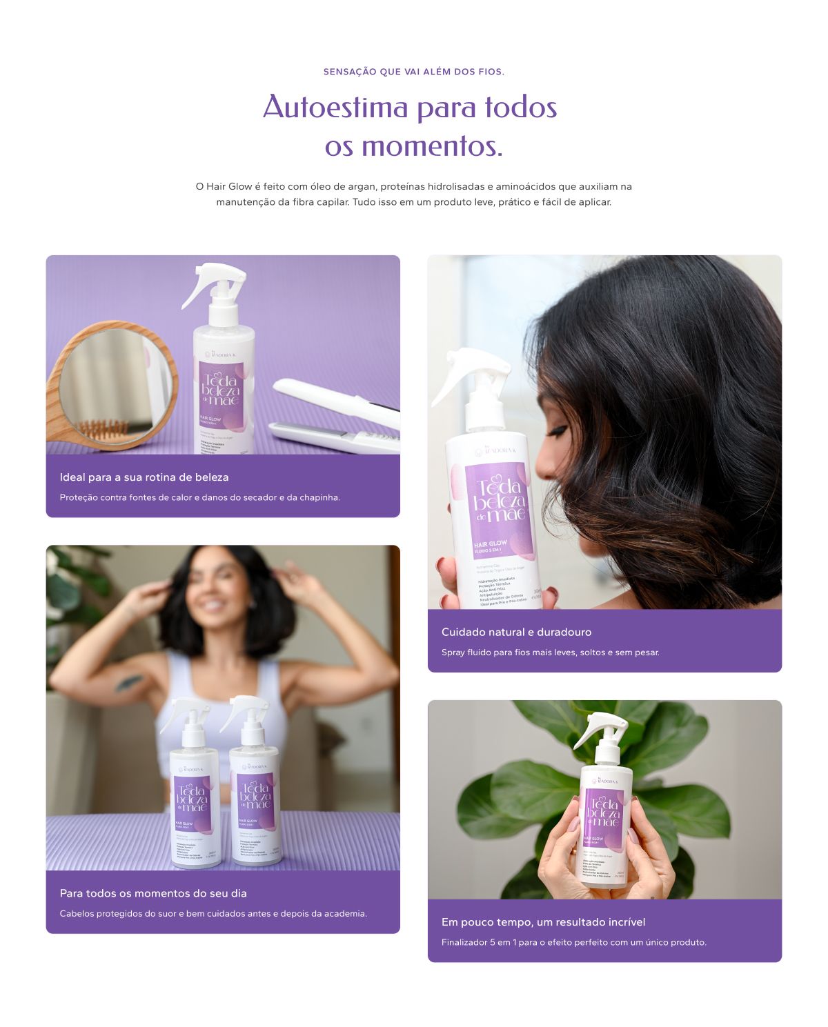 03
03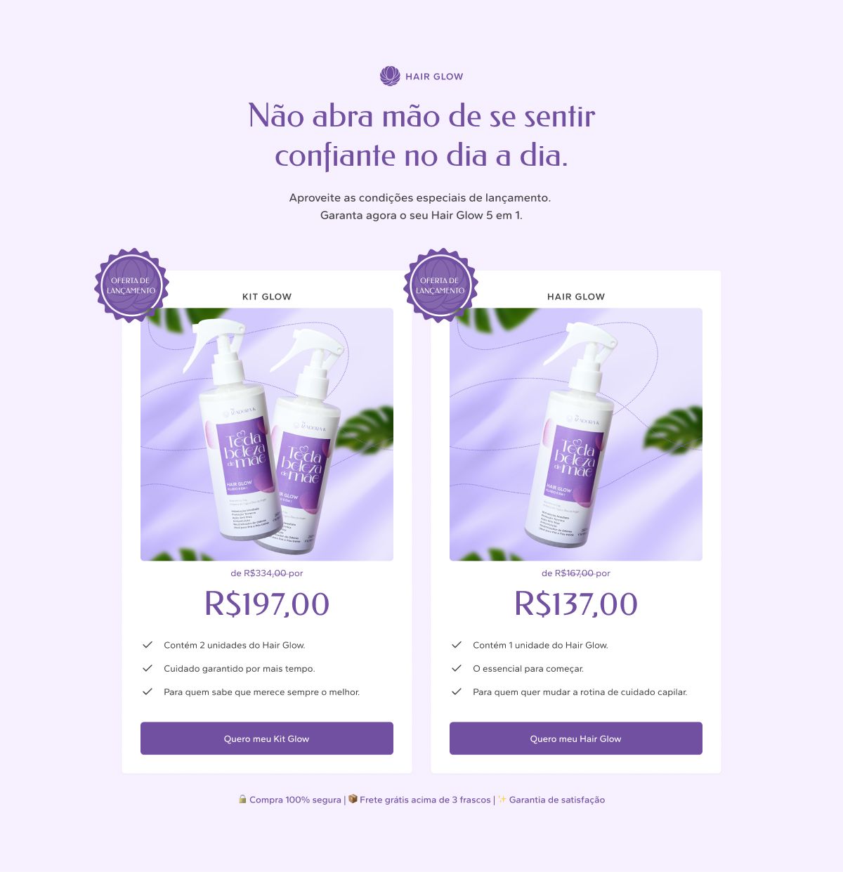 04
04
Full processContext, decisions and evidence, for those who want the detail.
Context
Hair Glow is a 260 ml 5-in-1 hair fluid from the "Toda beleza de mãe" line by Izadora K. The product was going to launch with no page of its own: the only sales surface was social media, which buys reach but not argument.
My scope was specific and worth stating upfront: UI and prototype. The copy arrived finished, from a sales page document written by the client. My job was not deciding what to say — it was deciding in what order, at what weight, and in how much space each thing gets said.
The problem
The line's audience is women with full schedules, and that single fact changes everything. She does not read a product page top to bottom. She scrolls, stops at one sentence, and decides.
That creates a concrete layout tension. The product has five benefits — hydration, heat protection, frizz control, anti-pollution, and pre/post workout — and five is exactly the count that turns into noise when presented as a list. A page that opens by dumping all five loses the reader before the third.
The other problem is that the product's real argument isn't technical. It's time. "Five in one" only means something to someone who reads it as five fewer bottles and five fewer steps at the bathroom sink.
My role
- Page structure and section order
- Desktop (1440) and mobile (375) UI
- Responsive adaptation of every section
- Navigable prototype and file organisation for handoff
Copy, art direction and photography came from the client.
Process
The base was the Creators Figma Kit together with the Braip UI Kit and Relume components. That isn't a backstage detail: with the component skeleton already in place, the time that would have gone into drawing boxes went entirely into the editorial decision — which section exists, in what order, with how much breathing room.
The work split three ways:
Ordering. Each section answers one question, and the next question only appears once the previous one has been answered. Promise, pain, how it works, proof, price, doubt.
Dosing. Where the copy allowed, the layout chose density. The five benefits became a column of short items beside the product shot — a fast vertical read, with none of them competing for emphasis.
Adapting. Eleven sections at 1440 px rebuilt for 375. The adaptation wasn't stacking: the two columns of the benefits block become a sequence, and the kit comparison, side by side on desktop, becomes a sequential decision on mobile.
Key decisions
Pain before benefit
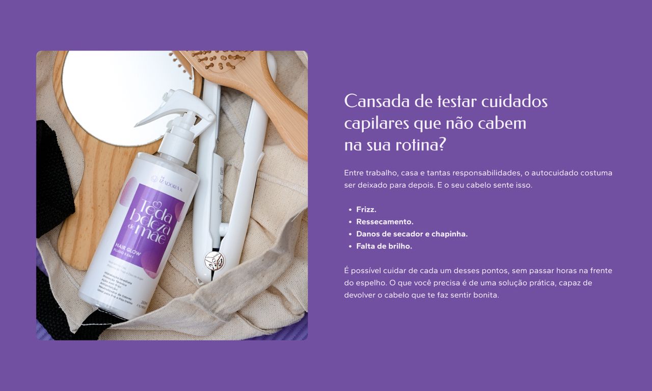
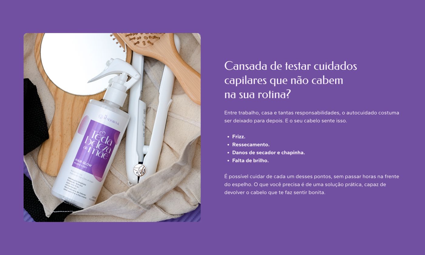
The second section of the page doesn't talk about the product. It asks whether you're tired of hair care routines that don't fit your life, and names frizz, dryness and heat damage before offering any solution.
That's deliberate. A reader who hasn't yet recognised the problem has nowhere to put the answer. The benefits section that follows lands better because it arrives as relief rather than as a catalogue.
Five benefits as one step, not as five

The heading carries the whole argument: five benefits in a single step. The items sit in a narrow column, short text, no decorative icons — the hierarchy says the point is the "single step", and that the five are its evidence, not its lead.
Proof through context, not product close-ups
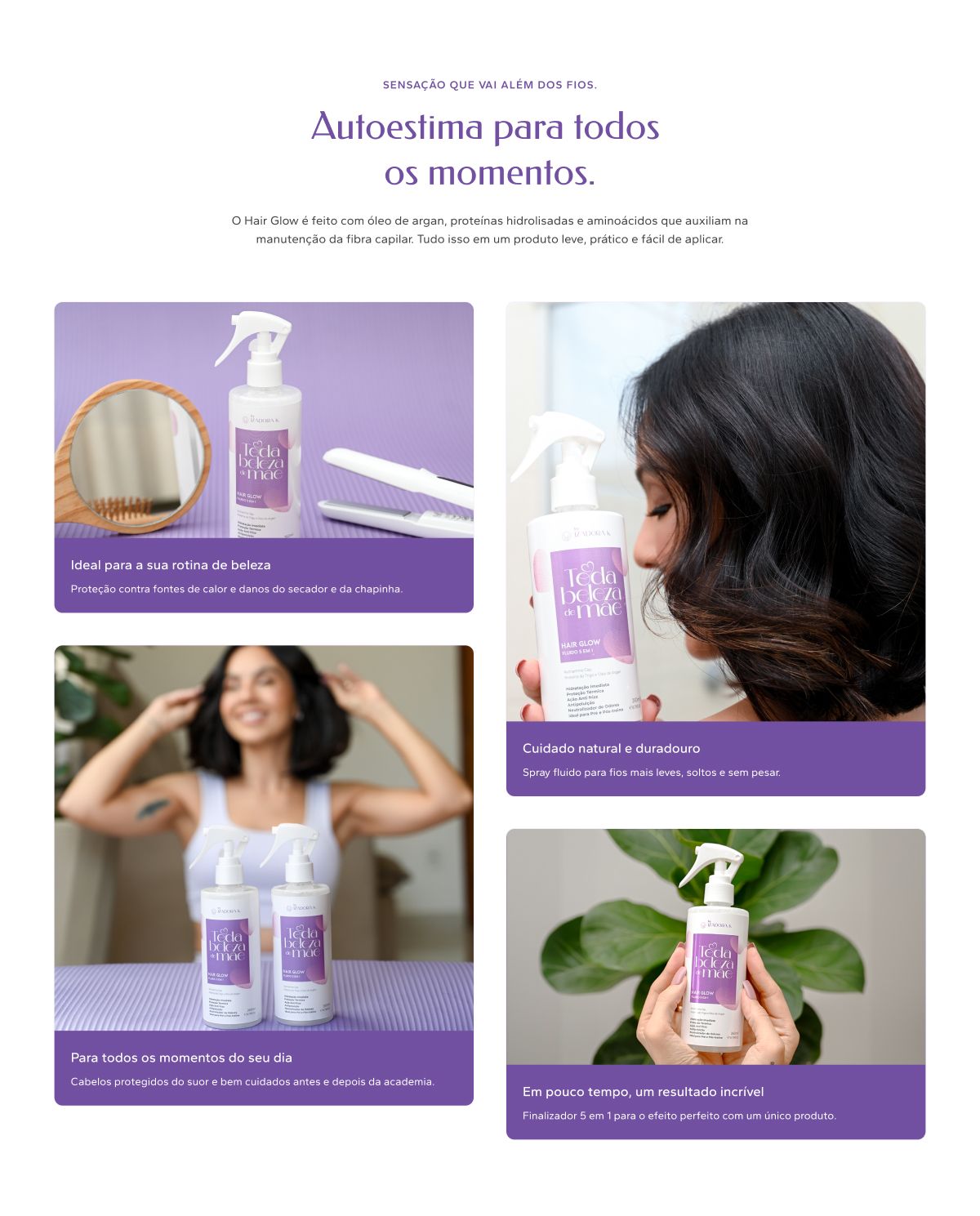
The lifestyle section shows the product in four everyday situations rather than four angles of the bottle. Each card ties a scene back to a benefit already introduced — the gym ties to pre/post workout, the flat iron ties to heat protection.
Two options, never three
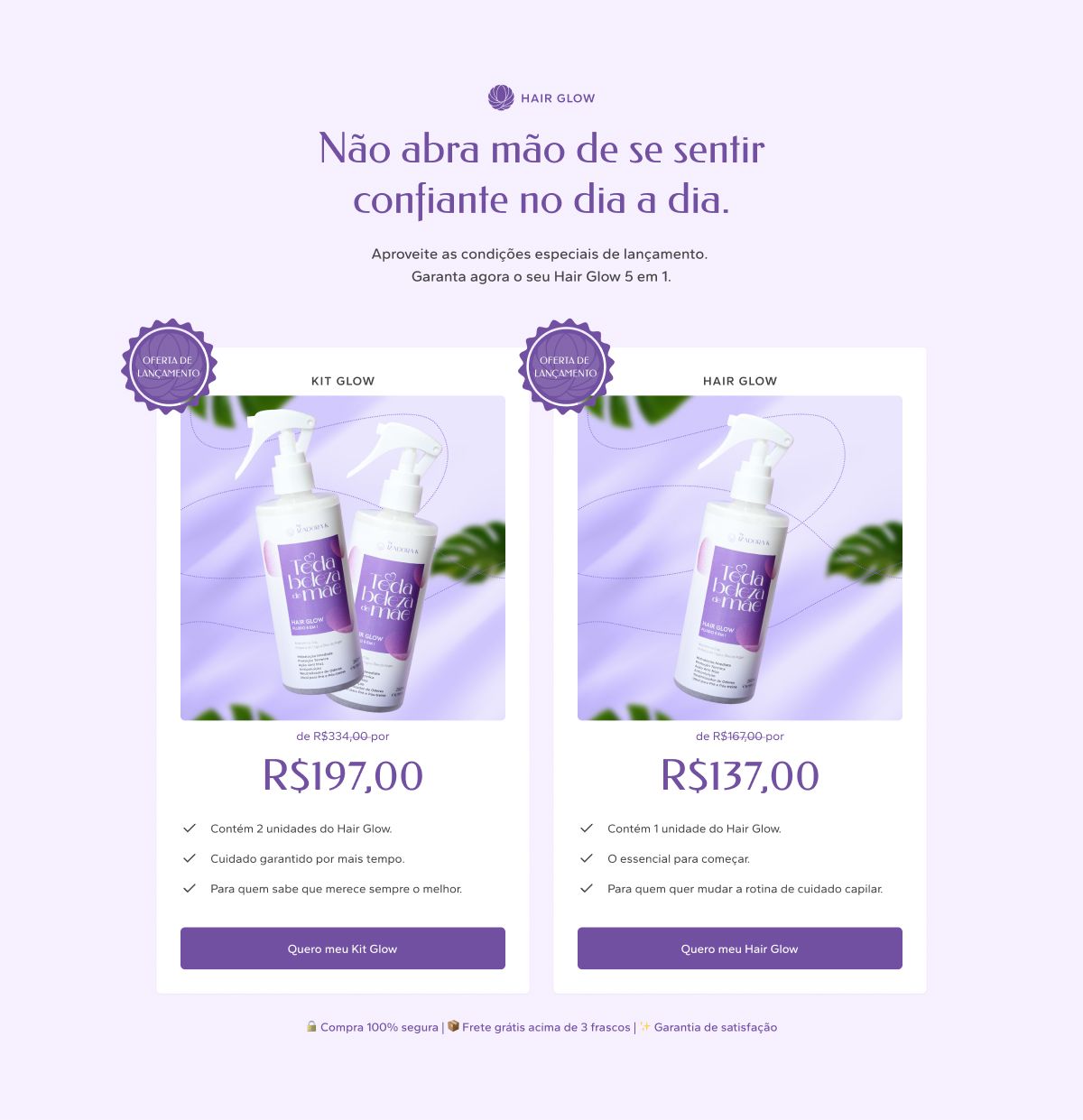
The offer presents exactly two paths: the two-unit kit and the single bottle. The bundle sits on the left, with the launch seal and the struck-through price visible, so the comparison happens without the reader doing arithmetic.
Three options would have turned a purchase decision into a spreadsheet task.
Marquee as breathing room
Between the dense blocks sit three thin horizontal bands carrying the purchase terms — secure checkout, free shipping, guarantee. They solve two problems at once: they give visual pause between long sections, and they keep the logistical objections present without spending a whole section on them.
Outcome
The landing page shipped complete at both breakpoints, with a navigable prototype and the file organised for handoff — named sections, components instanced from the kit, and the version logged in the file's changelog.
I don't have a conversion number to show. The page shipped at launch and the metric stayed on the client's side; publishing a percentage I didn't measure would be worse than having none.
What's still open
The testimonials section exists in the layout but still holds placeholder text. The real content — names, photos and customer quotes — depended on collection that wasn't ready when the design closed.
I'm writing that down because the alternative would be showing a screenshot of invented social proof in a case study about a sales page, which is exactly the kind of thing the whole page was designed not to do.
What I'd do differently
I'd have designed the testimonials section after the content existed, not before. A social proof block laid out over lorem ipsum assumes a shape — five short cards, all the same size — that real testimonials almost never respect. When the true text arrives, the layout will have to give, and leaving the space open would have been cheaper than filling it with a provisional form.
Outcomes are qualitative: I'm not cleared to publish these projects' metrics.
 Next →Copa PlayersSeasonal campaign, steady system.