Braip Checkout
The 15 seconds that close the sale.
Rebuilding a single-page checkout on the new design system, and fixing its most fragile stretch — the fifteen seconds someone spends typing a card number.
- Problem
- The legacy checkout was the last step of every sale on the platform and the least cared for — two competing flows, components outside the design system, and the moments of error and waiting never designed at all.
- What I did
- Rebuilt the single-page checkout on the V2 design system, mapped the unhappy path and the loading states, and designed a motion that fills the credit card visually as the fields are typed.
- Outcome
- Flow delivered on desktop and mobile, with a clickable prototype covering confirmation and three kinds of decline. Conversion metrics stay with the product team — they are not mine to publish.
Full processContext, decisions and evidence, for those who want the detail.
Context
Braip is a digital sales platform, and the checkout is where everything that happens before it gets collected or lost. It isn't a product screen: it's the final step of every sale the platform processes, for thousands of stores that have no control over how it looks.
When I picked up the file, two legacy checkouts were live at once — a single-page version and a multi-step version. Neither used the current design system: they were V1 screens, built before the variable system existed.
The actual scope is recorded in the file's changelog, and it's worth being literal about it: rebuild V1 using the V2 design system. That is not "redesign from scratch with a free hand". It's translation work under a hard constraint — the business flow already existed, the payment methods already existed, and what I could change was the form, not the contract.
The problem
The design tension here isn't a full screen. It's a screen full of mandatory things.
A Brazilian checkout doesn't ask for email and a card. It asks for name, email, phone, postcode, street, number, unit, district, city, state, shipping method, payment method, card number, cardholder, expiry, CVC, installment plan and the cardholder's tax ID — before any confirmation. Add coupon, order bump, calculated shipping and the Pix discount on top. It's a long form by law and by acquirer rules, not by carelessness.
So the question couldn't be "how do we cut fields". It had to be: how do we make a long form not feel like an obstacle while it's being filled in.
There was a second, quieter problem. The legacy checkout had screens for when things go right. It had none for when they go wrong. Declined card, insufficient funds, a failed Pix issuance, the seconds while the payment is being processed — none of it was designed. In practice that means the worst moment of the experience was the only one without design.
My role
- Rebuilding the single-page checkout on the V2 design system
- Mapping and designing the unhappy path — declines, failures and error states
- Loading states (skeletons) for payment processing
- Full responsive adaptation: desktop 1440 and mobile 390
- The credit card fill motion
- Clickable prototype per payment method, with confirmation and decline
What was not mine: the checkout's business rules, the available payment methods and the legal footer copy — all inherited. And the V2 design system itself, which is team work; I work on its token track, but the components used here came from the library, not invented for this case.
Process
I started with an inventory, not a drawing. The file gained two sections marked
⚠︎ OLD — the legacy single-page and multi-step flows — kept side by side with the
new ones. That looks like file housekeeping, but it was the most useful process
decision of the project: with "before" visible next to "after", every divergence
becomes an explicit question instead of a silent change.
Then I split the work into three tracks running in parallel, each with its own section in the file: the happy path (modern single page), the unhappy path (declines and failures) and the loading states. Treating error as its own track, with its own time budget, is what kept it from becoming Friday's last hour.
The card motion started as a separate draft before entering the flow — an isolated
motion draft card section, where I could get it wrong without breaking good
screens.
Key decisions
The long form shows everything, but at two weights
Context: every field is mandatory, and none can hide behind an accordion without creating the feeling that the form never ends.
Rejected alternative: the multi-step flow, which existed and still exists as a variant. It solves the perception of length by breaking it into steps — but trades one long form for three screens with three chances to abandon and a back button that doesn't restore state properly.
Why this one: the single page shows the whole cost at once. It's honest, and it's faster for people who already know what they want. The work becomes hierarchy: two blocks side by side on desktop, identity and delivery on the left, payment on the right, and the installment total immediately above the button — the last number someone reads before deciding.
The credit card fills in as you type
This is the decision the case is named after.
Context: the card block is the most fragile point in the entire checkout. It's where someone types sixteen digits they don't know by heart, read off a rectangle of plastic held in the other hand, under the permanent suspicion of typing them into a site they maybe shouldn't.
Rejected alternative: silent validation — accept the data and only react on error. It's the legacy checkout's pattern and the cheapest to build. It's also what turns one mistyped digit into an acquirer decline three screens later, when the card is no longer in hand.
Why this one: I designed the card as a visual representation that fills in real time. The number appears on the card as it's typed, grouped in fours; the cardholder name appears below it; the network is detected and acknowledged before the field is finished. The card becomes a mirror of what was typed.
What this solves isn't aesthetic. It's proofreading: you compare the card on screen with the card in your hand and catch the error the moment it happens — not after the decline. And it solves a second, trust problem: an interface that reacts precisely to what you type signals that it's handling it carefully.
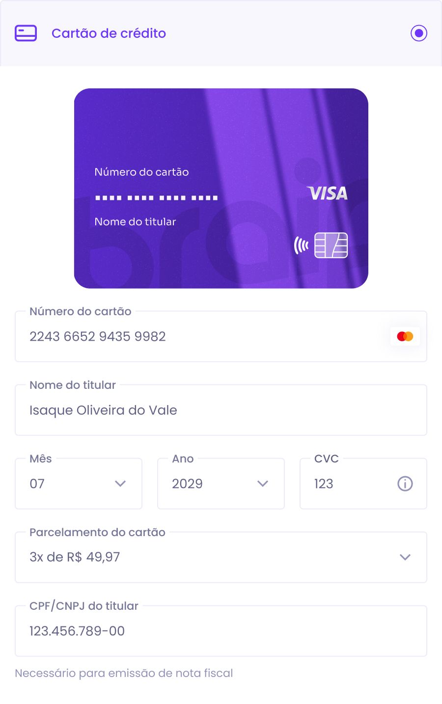
The motion has one rule I held to throughout: it never delays typing. The animation follows the field, not the other way around. No transition blocks the next character, and focus is never moved automatically between fields — auto-advance breaks correction for anyone who mistyped the eleventh digit.
The unhappy path got as much file as the happy one
Context: a declined card is the most common outcome after success, and it was the only one without a screen.
Why this one: the prototype covers three distinct declines — insufficient funds, issuer decline, and a Pix or bank-slip issuance failure — because all three ask something different of the person. Insufficient funds asks for another card. Issuer decline asks for a call to the bank. Issuance failure asks only to try again. A generic "payment not authorised" screen pushes all three into the same place: abandonment.
Waiting is designed, not absent
Context: between pressing "Buy now" and the acquirer's answer there's a real gap, seconds long, in which the screen has nothing to say.
Why this one: I designed the processing state as a skeleton, shaped like the content that's coming, instead of a spinner over a blanked screen. A skeleton says "content is coming here, this size"; a spinner says "wait". In the moment right after someone authorised a payment, the difference between those two messages is the difference between waiting and doubting.
Mobile isn't the same page, narrower
Context: at 390 px the two side-by-side blocks become one column, and order starts to matter more than layout.
Why this one: on mobile the product summary moves to the top, right under the banner — before any field. On desktop that information can live alongside; on mobile it has to come first, because it's what anchors someone to what they're buying through the next thirty fields. The card block keeps the motion intact: it's the only checkout element that wasn't simplified at the smaller breakpoint.
Outcome
What was delivered:
- Single-page checkout rebuilt on the V2 design system, on desktop (1440) and mobile (390)
- Multi-step variant maintained and updated in parallel
- Unhappy path designed: three decline types plus issuance failure
- Loading states with skeletons for payment processing
- Order-confirmed screens for card, Pix and bank slip
- Card fill motion, with a behaviour specification
- Clickable prototype covering all four payment methods
On numbers: I don't publish a conversion rate for this work. The metric exists and belongs to Braip's product team; it measures the entire checkout, including backend and payment-policy changes that aren't mine. Attributing that number to design would be comfortable and would be false.
What's still open
- The input support fields still show design-system default strings (
Message text,Title) in the help and error message slots. That's a component default, not content — but it means the real error copy for each field hasn't been written yet, and writing it is UX writing work that fell outside this round. - Both legacy sections remain in the file, marked
⚠︎ OLD. They only leave when the migration actually finishes in production.
What I'd do differently
I designed the card motion after locking the payment block's layout, and that order was my mistake. By the time I animated it, the card already had a position, a size and a distance from the fields set by static composition — and the animation had to fit inside that. If motion had come in alongside layout, the card would probably sit closer to the number field, and the link between the digit typed and the digit shown would be a shorter read.
The second: I spent too long on the happy path before opening the unhappy one. I knew from the inventory that the error states were missing, and still left them for later — which made the unhappy path a separate section of the file instead of something born with each screen. Error states aren't a chapter. They're a property of every screen, and the file would have been more coherent if I'd treated them that way from the start.
Outcomes are qualitative: I'm not cleared to publish these projects' metrics.
 Next →HG PagamentosA brand for people who move money.