AML Locações
From blank page to live site.
A crane-truck rental site designed to feel as solid as the equipment it rents out.
- Problem
- A crane-truck rental company running since 1996, with no online presence that matched the trust its service already earned.
- What I did
- Designed a single-page site with a deep teal and gold palette, large type, and contact one click away at any scroll depth.
- Outcome
- Live at amllocacoeseservicos.com.br, taking quotes by form and by WhatsApp. Metrics stayed with the client.
 02
02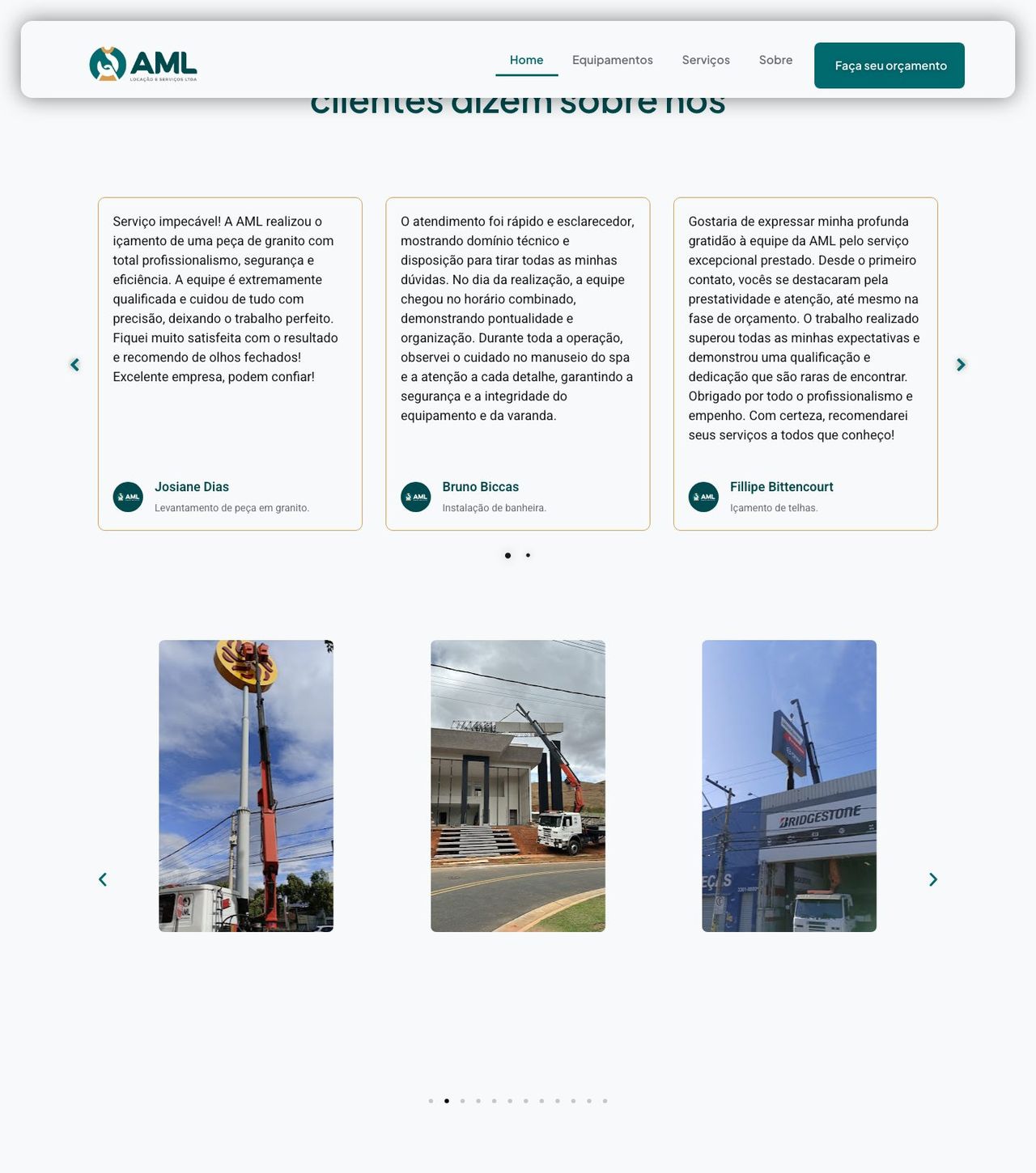 03
03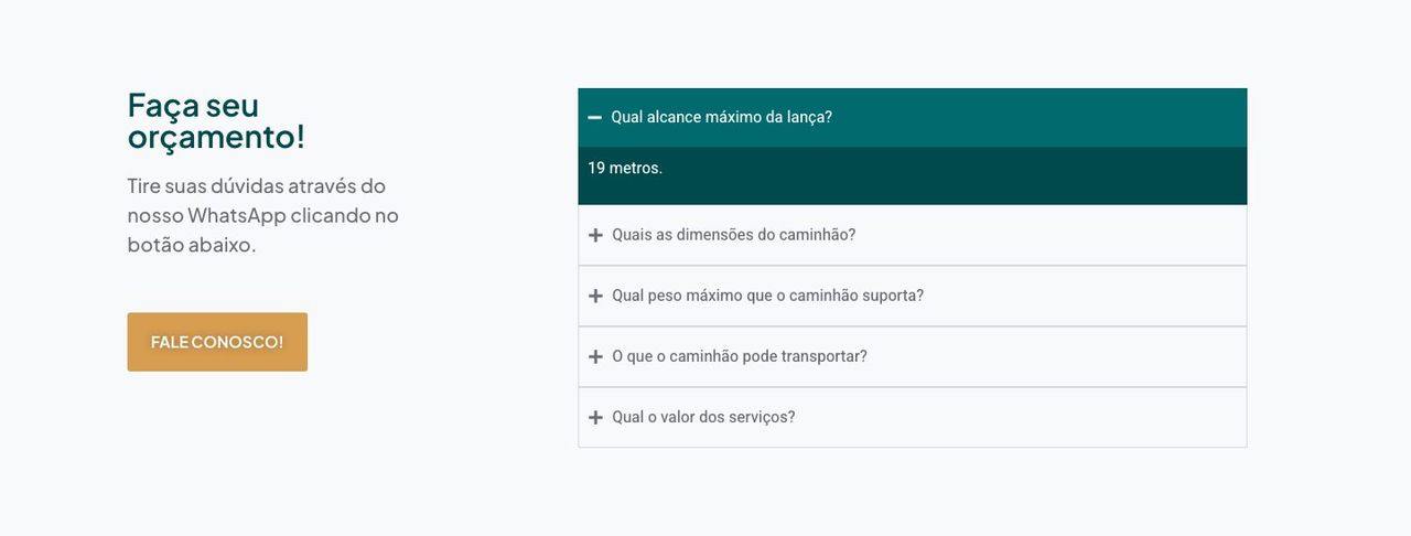 04
04
Full processContext, decisions and evidence, for those who want the detail.
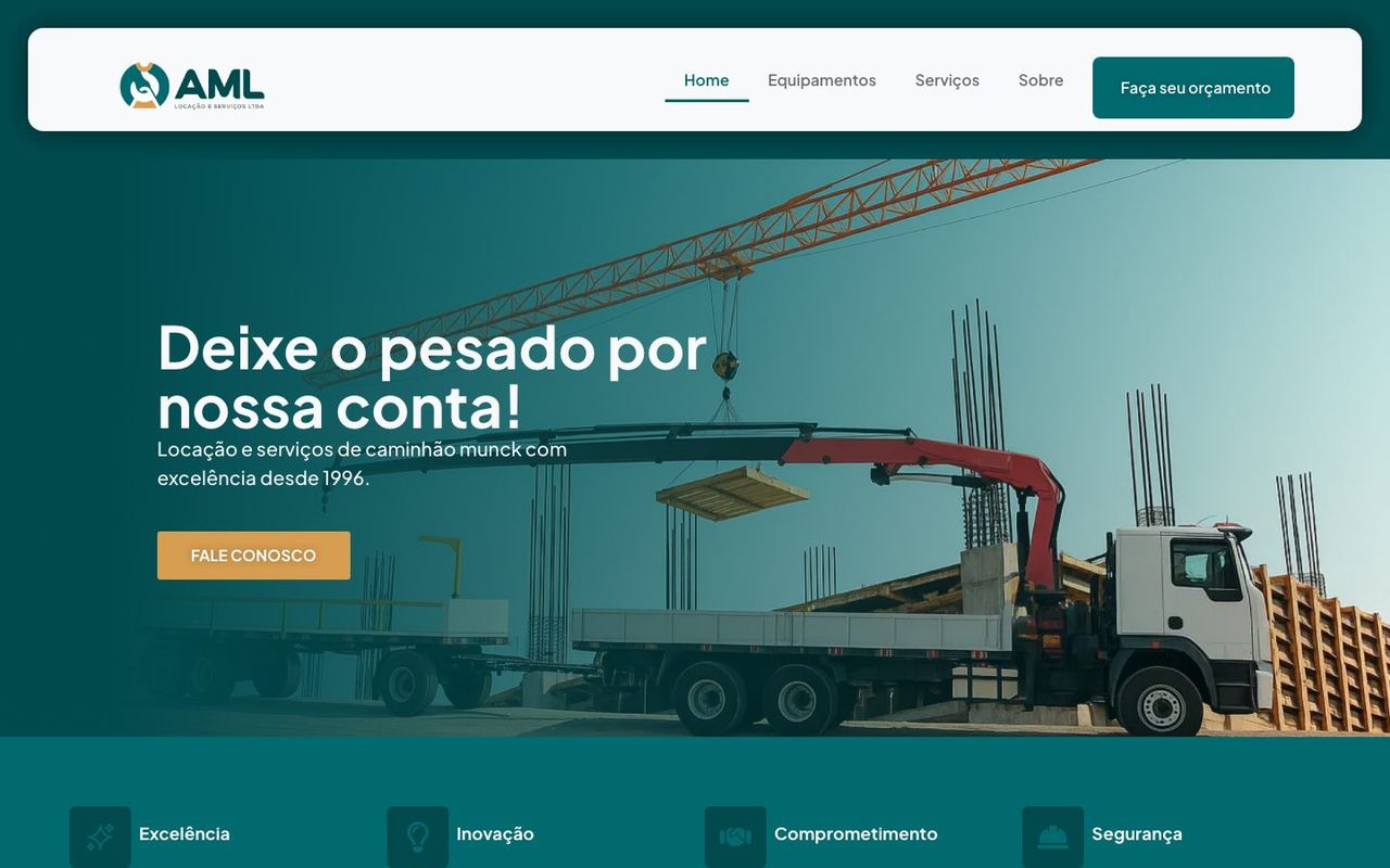
AML Locações e Serviços rents crane trucks in Governador Valadares, Brazil, and has been running since 1996. Their product is weight: cranes, loads, liability. The site had to carry that feeling without turning into a technical catalogue — people hiring a crane truck decide on trust and a phone call, not on a spec comparison.
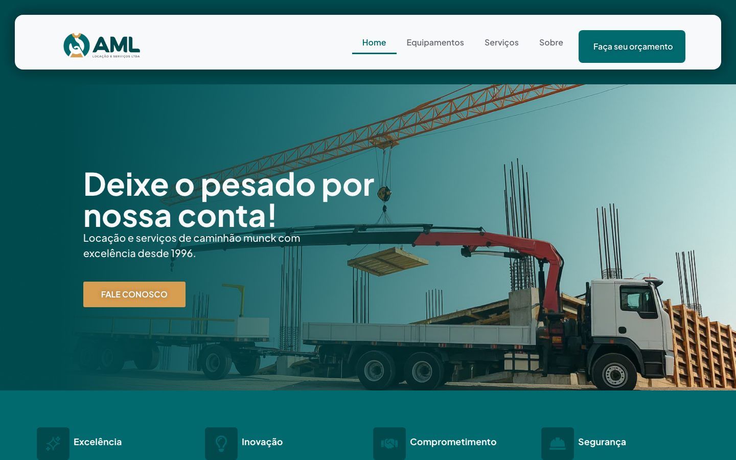
The design
Palette. Deep teal (#004A4E) as the base, a lighter teal (#006A6F) to separate blocks,
and gold (#D79D51) reserved strictly for action and emphasis. I made dark the dominant
colour so the equipment photography — open sky, steel, worksite — would land with contrast
without heavy retouching. Gold shows up rarely, which is why it works: where it appears,
it's meant to be clicked.
Type. Plus Jakarta Sans for headings, Heebo for body copy. The headline — roughly "leave the heavy lifting to us" — is the only sentence in the first fold set large: a promise of service in human language, not equipment language.
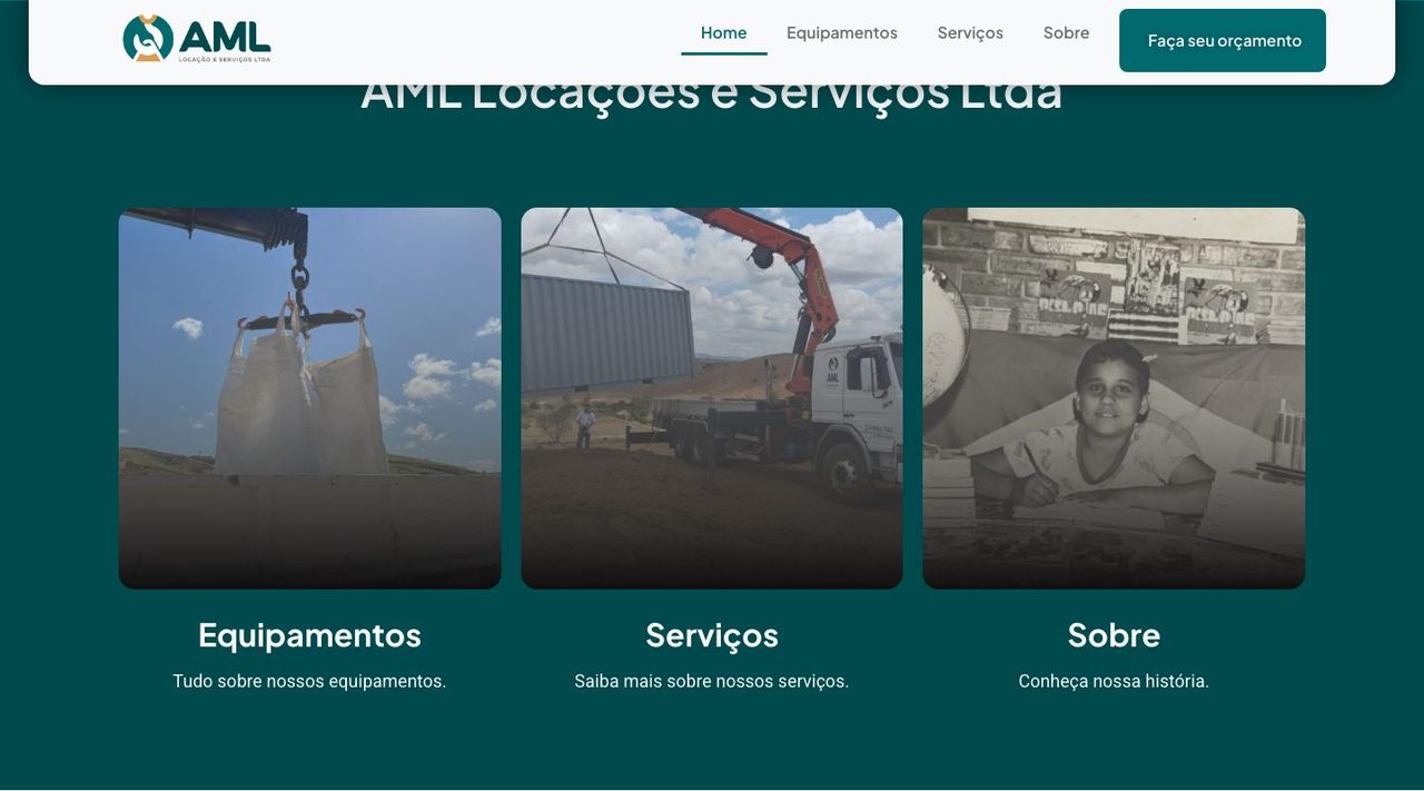
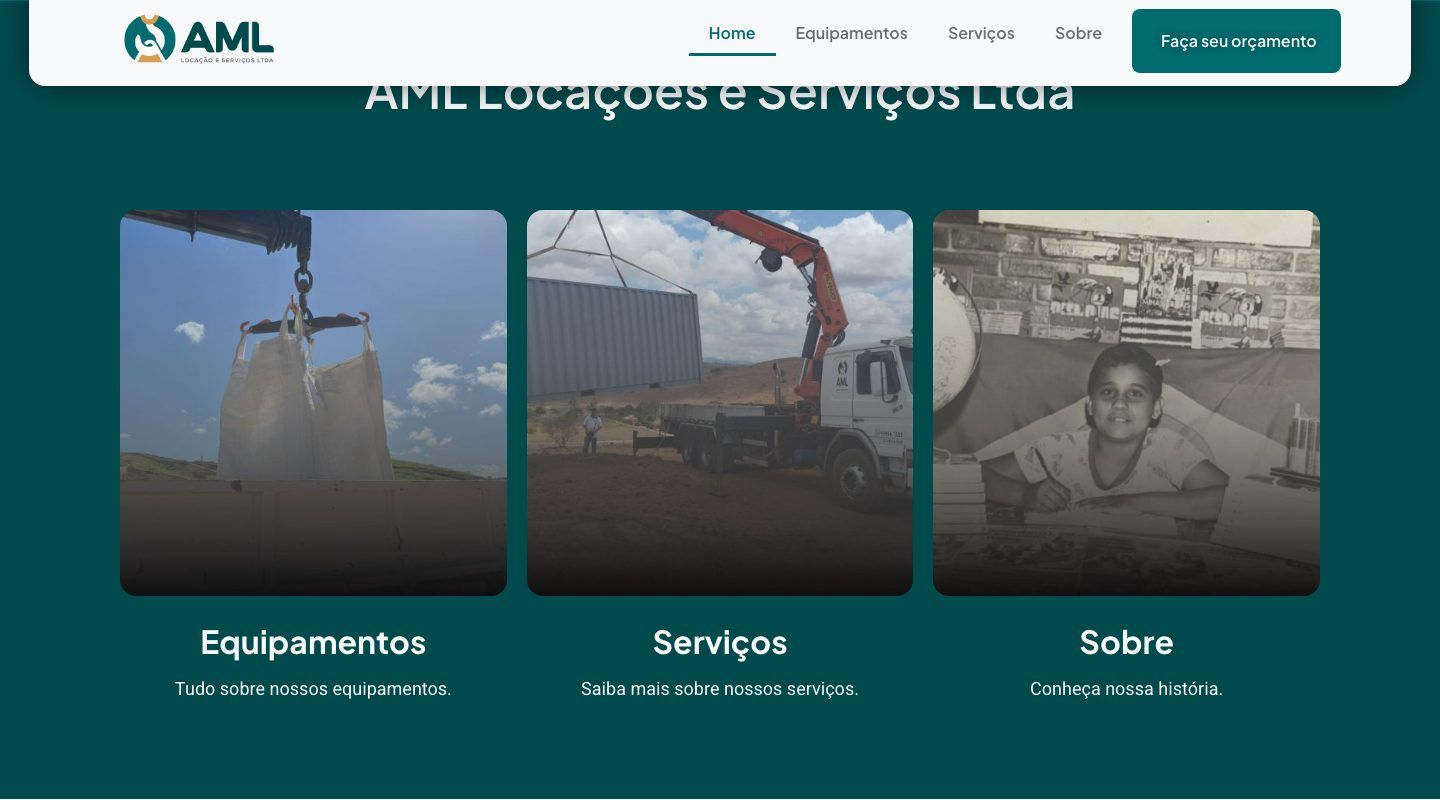
Structure. One page, five movements: promise, four pillars (excellence, innovation, commitment, safety), three doors into the inner pages (equipment, services, about), social proof, and contact. Each block exists to answer one specific doubt, in the order that doubt shows up.
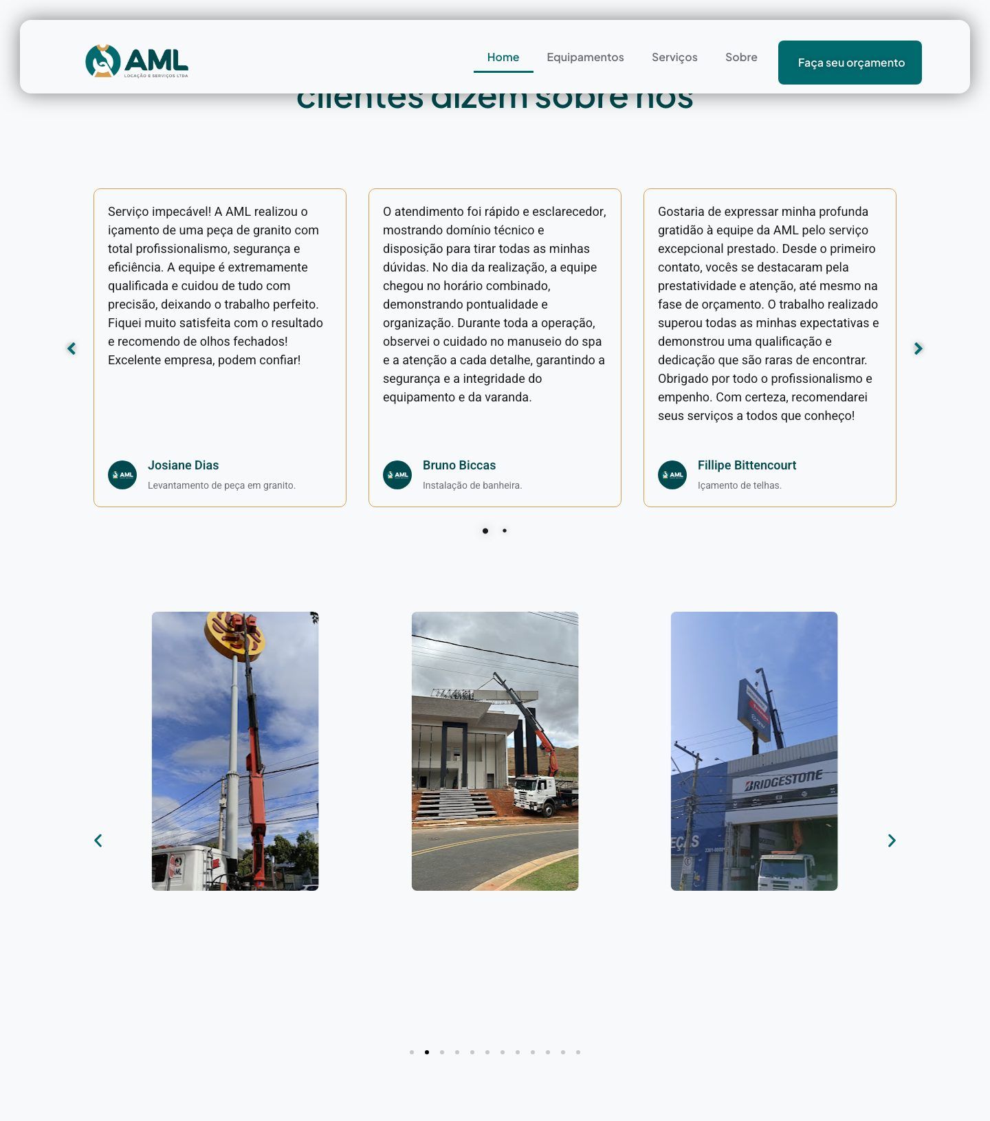
Social proof as a full section, not a footer strip
Heavy service sells on reputation. Instead of squeezing testimonials into a band, I gave them the tallest block on the page, with full accounts — response time, punctuality, execution — rather than showcase one-liners. It's the largest section on the site, deliberately: it's the argument that converts.
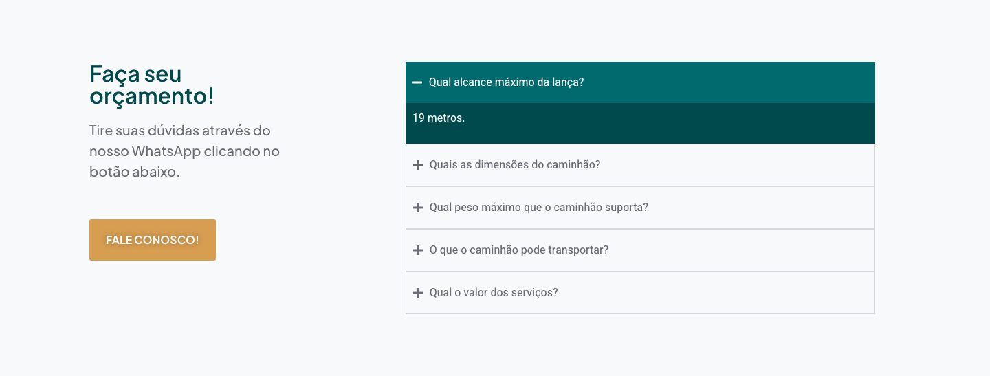
Two contact routes, neither one hidden
The closing block offers a form and WhatsApp, because this audience settles things by message. A short FAQ answers the three questions that always come up — boom reach, truck dimensions, load capacity — before contact, so the conversation starts at negotiation instead of specification.
How it was built
WordPress with Elementor — the client's call, since they needed to edit content themselves afterwards. That shaped the design: nothing that would depend on custom code to keep working once someone else touched it. I did the design, the equipment photo treatment, the build, and the on-page SEO structure (titles, heading hierarchy, meta title naming the region served).
The copy is by Bianca Lima, headline included. My job was to give it the hierarchy and the room it was asking for.
What I'd do differently
I let the home page run to 4,997 px on desktop and 6,130 px on mobile — on a phone, the social proof only arrives after a long scroll, exactly where it's needed most. Doing it again, I'd drop the pillars block on mobile and move the testimonials up.
I also instrumented nothing. There's no click event on the WhatsApp button or the form submit, so I don't know which of the two routes the quotes actually come through — the one question the site could have answered on its own.
Outcomes are qualitative: I'm not cleared to publish these projects' metrics.
 Next →Braip App — LaunchYour sales in the palm of your hand.